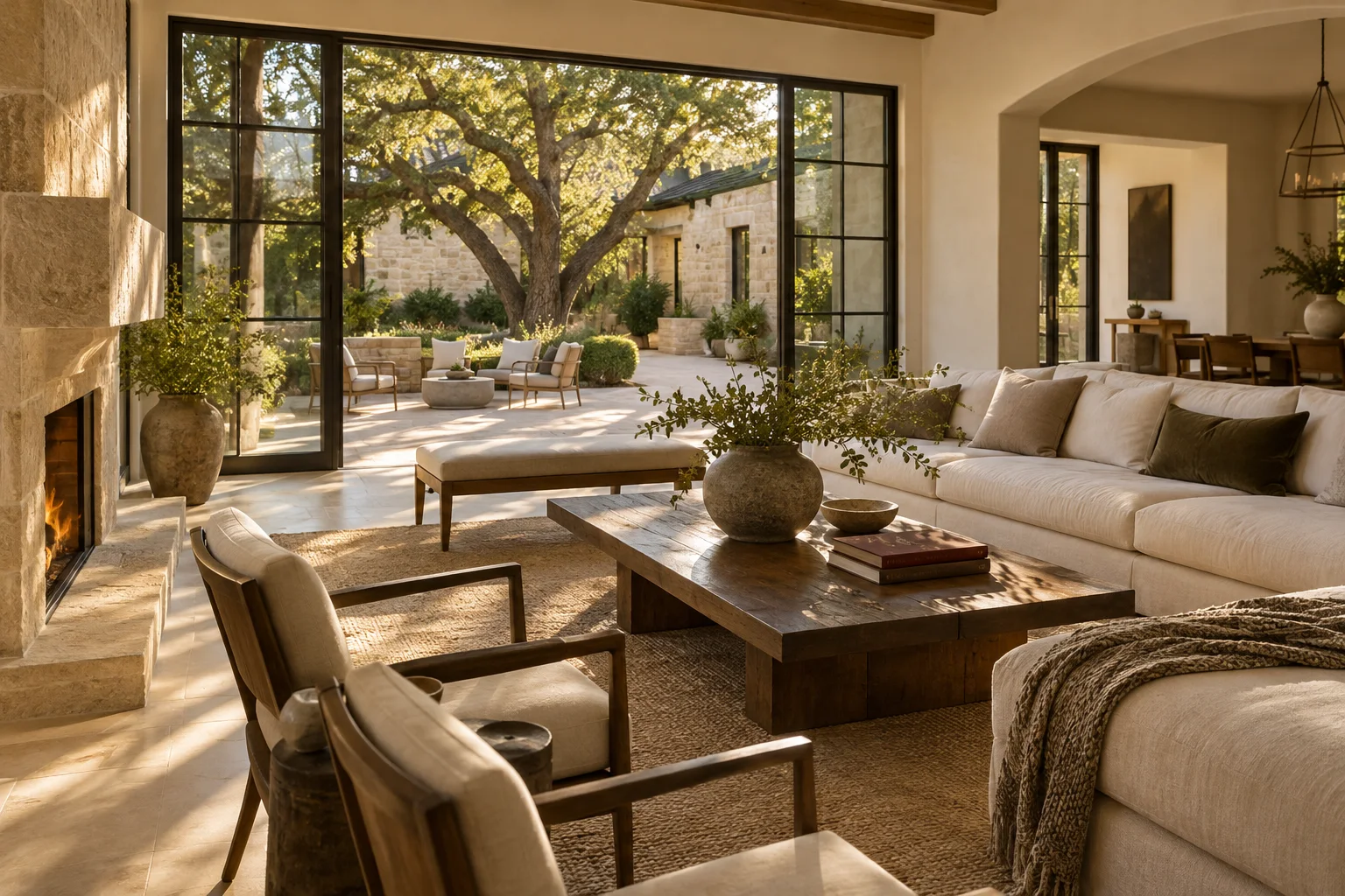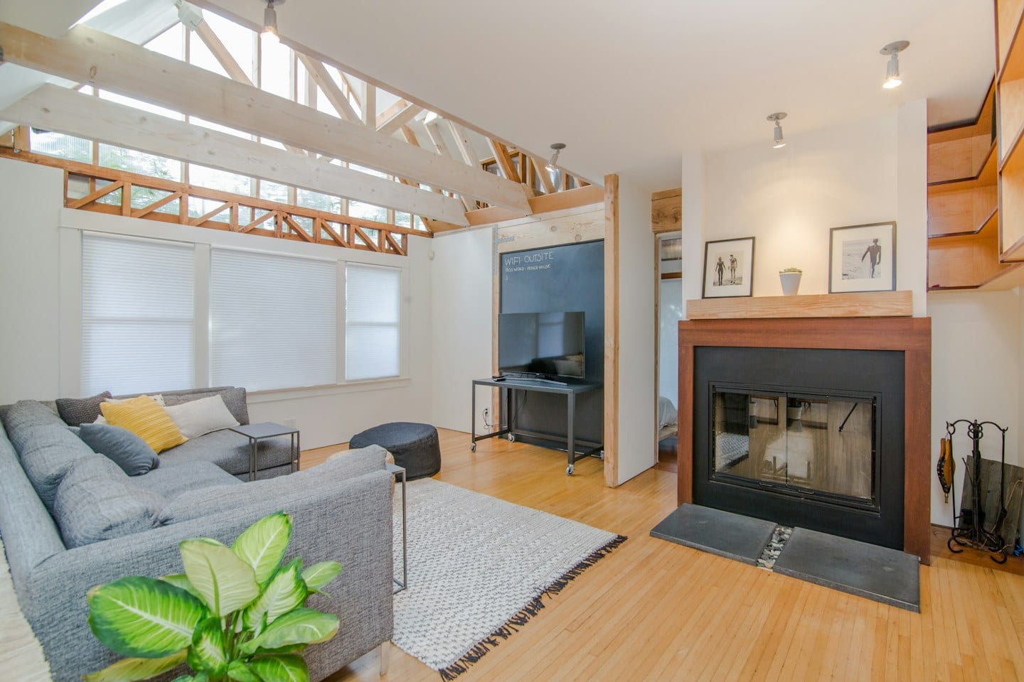
A small square of color on a paper swatch rarely tells the whole story once it meets your living room walls. What looks like a soft, neutral sand in a bright retail showroom might transform into a heavy, dark ochre once it is placed under your specific ceiling lights or beside a large window.
The Importance of Personal Labeling
When you begin collecting samples, the temptation is to keep them in the original containers or simply lay them against the wall. However, as your collection grows, the subtle distinctions between shades begin to blur. To maintain clarity, assign a unique identifier to every sample you test. You might use a piece of painter's tape to write a code on the sample board, such as "Sample A" or "Kitchen 1." This prevents the frustration of staring at two nearly identical greys and wondering which one was the cooler tone you preferred during your initial selection.
This level of organization becomes vital when you are navigating a budget that requires you to separate the essentials from the optional additions. For instance, you may decide that a high-quality finish for the main living area is a non-negotiable necessity, while a more expensive, designer-specific shade for a guest bathroom is an optional luxury you can defer. Having a labeled system allows you to evaluate the visual impact of each choice without losing track of your priorities.
Watching the Light Shift
Color is a moving target. A shade that feels bright and airy during a sunny Texas morning may appear muted or even muddy during a cloudy afternoon or under the glow of evening lamps. To see the true character of a color, you must observe it during the specific times you actually inhabit the room.
For example, if you are choosing a color for a dining room used primarily for evening gatherings, a sample that looks perfect at noon might feel too stark once the sun goes down. You might find that a color you initially thought was too dark actually provides the exact atmosphere you desire when the artificial lighting is turned on. The tradeoff here is between the immediate visual appeal of a bright color and the long-term mood the color creates during your most frequent hours of use.
Making the Final Selection
Before you commit to a full gallon, take a moment to step back from the wall. Walk to the opposite side of the room and look at how the sample interacts with your existing furniture, flooring, and window frames. Ask yourself if the color complements the items you intend to keep and if it aligns with the atmosphere you want to cultivate. Once you have observed the labeled samples through various light cycles and compared them against your list of essential versus optional upgrades, you will be ready to make a decision based on how the color actually lives in your home.